What are Feature Dashboards?
Feature dashboards bring together deeper performance reporting for key verticals, helping you move beyond surface-level metrics to understand what's driving on-site presence and engagement.
Content Dashboard
The Content dashboard helps you understand how tenants interact with your posts, events, and deals. Use it to identify what's resonating, optimize your content strategy, and drive more engagement across your portfolio.
When to Use This Dashboard
-
Evaluating which content topics and formats drive the most engagement
-
Identifying top-performing posts to replicate success
-
Understanding when and where tenants consume content
-
Benchmarking tenant companies by engagement levels
-
Optimizing posting schedules and content mix
Key Metrics
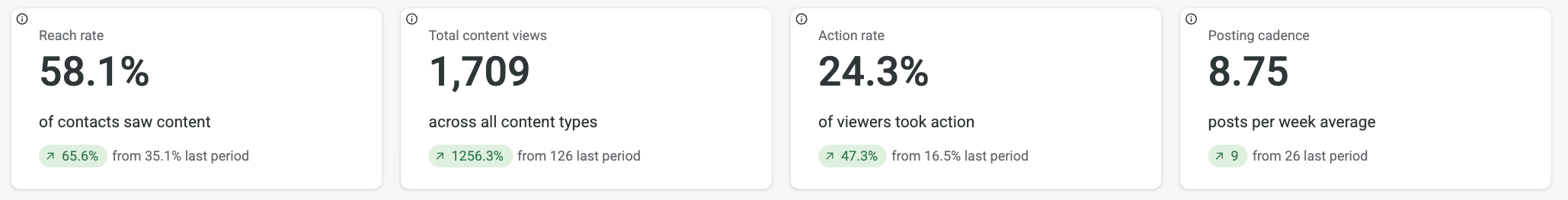
Reach Rate
The percentage of contacts who viewed at least one piece of content in the past 90 days. This tells you what proportion of your audience is actually engaging with content. A low reach rate may indicate your content isn't surfacing effectively or your audience needs to grow.
Total Content Views
The total number of content page views across all posts, events, and deals over the past 90 days. This is your overall engagement metric showing how many times tenants have viewed content.
Action Rate
The percentage of viewers who took an action on content (like clicking a CTA button, RSVPing to an event, or claiming a deal). Only content with a CTA button is counted as actionable. This measures conversion from viewing to engagement.
Posting Cadence
The average number of new content posts that went live per week over the past 90 days. This shows how frequently you're publishing new content. Consistent posting typically correlates with higher engagement, but quality matters more than quantity.
Dashboard Cards
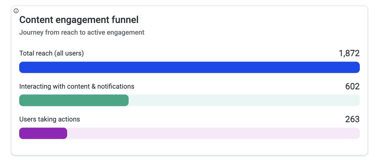
Content Engagement Funnel
Shows the journey from your total audience size down through viewers to people who took actions:
-
Total Reach (All Users): Your full potential audience
-
Interacting with Content & Notifications: Users who viewed content
-
Users Taking Actions: Users who clicked, RSVP'd, or claimed
Use this to identify where drop-off occurs. A large gap between viewers and actions suggests your content needs stronger calls-to-action.
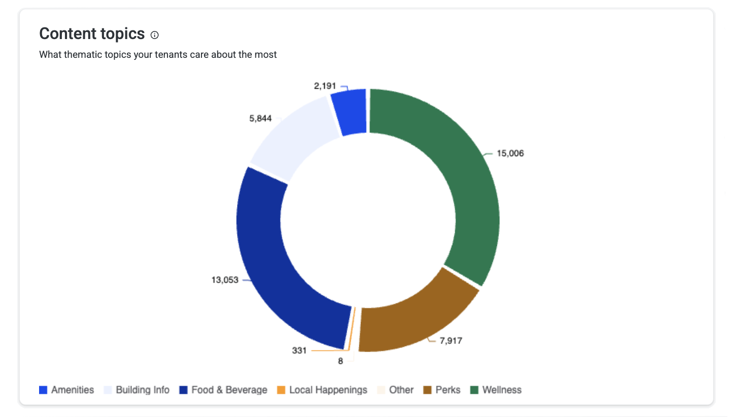
Content Topics
Breaks down content views by thematic topic (Amenities, Building Info, Food & Beverage, Local Happenings, Perks, Wellness). Use this to align your content calendar with tenant interests.
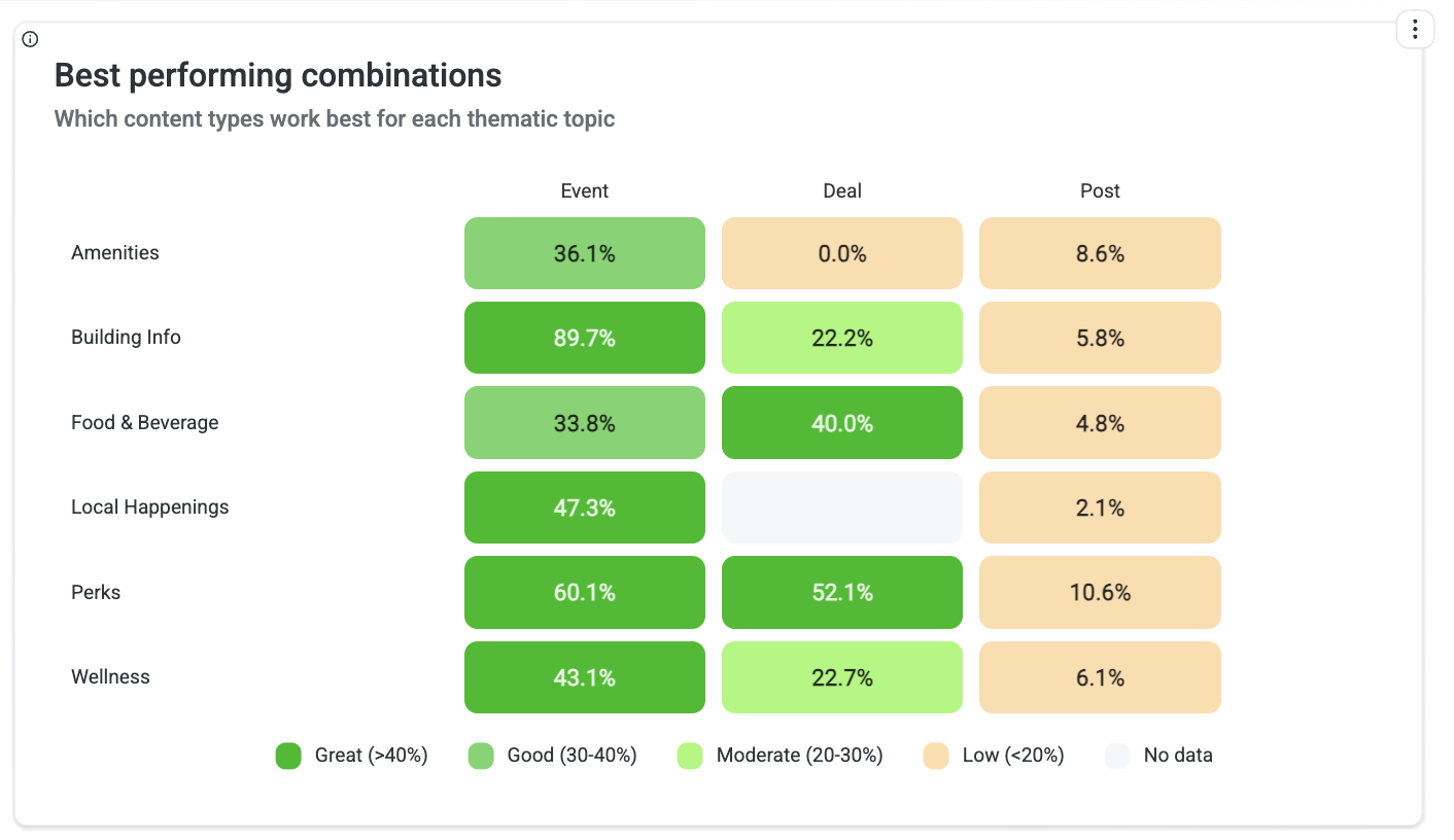
Best Performing Combinations
Shows action rates for each content type (Event, Deal, Post) by thematic category. This helps you identify which combinations of format and topic drive the highest engagement. For example, you might discover that Wellness content performs best as Events while Perks work better as Deals.
Content Performance Leaderboard
Ranks individual pieces of content by views and actions, showing which specific posts, events, or deals are resonating most. Use this to identify successful patterns and replicate what works. Pay attention to both high-view and high-action-rate content—they tell different stories.
Tenant Engagement Leaderboard
Ranks tenant companies by total actions taken, showing which organizations have the most engaged employees. High-engagement tenants can serve as case studies or partners for programming. Low-engagement tenants may need targeted outreach.
Top Individual Users
The 10 most engaged individuals by total actions taken, highlighting your power users. These are your building champions—consider engaging them for feedback, testimonials, or to help promote new initiatives.
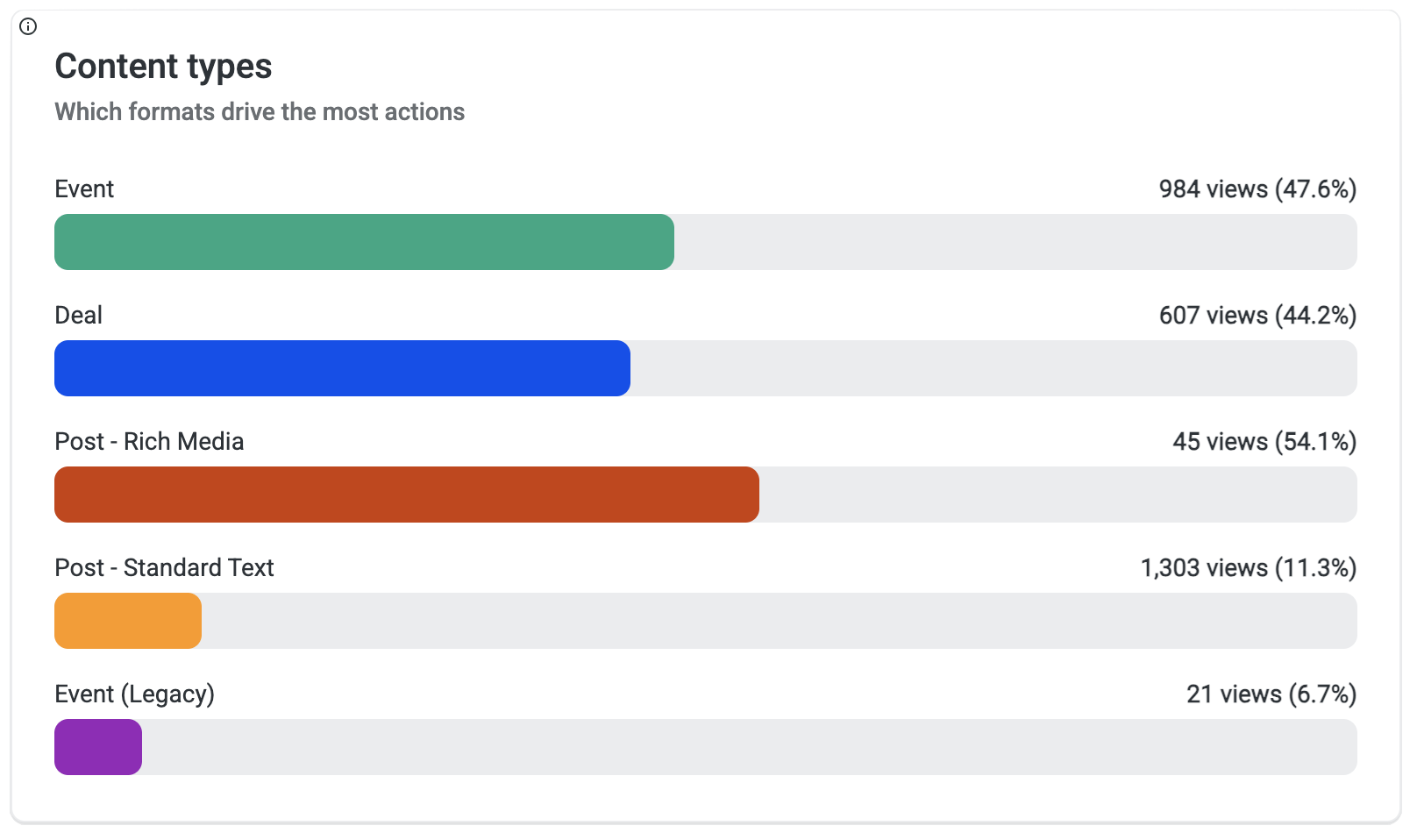
Content Types
Compares engagement across different content formats:
|
Format |
Description |
|---|---|
|
Event |
Bookable experiences with date/time |
|
Deal |
Claimable offers and promotions |
|
Post - Rich Media |
Posts with images or video |
|
Post - Standard Text |
Text-only posts |
|
Event (Legacy) |
Events from the previous system |
Use this to understand which formats drive the highest views and action rates.
Content Engagement by Platform
Shows where tenants are interacting with content—Android app, iOS app, or web. This helps you understand your audience's preferred channels and optimize content for those platforms.
.png?cb=43b4df7a9349e1fa12ebf918af783608)
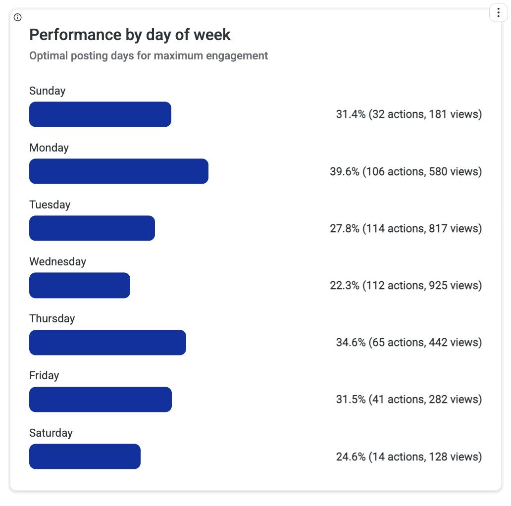
Performance by Day of Week
Shows which days see the highest engagement. Use this to schedule important content on high-traffic days and avoid publishing key announcements when engagement is typically low.
Performance by Time of Day
Reveals what times of day tenants are most active with content. Optimize your posting schedule to publish when tenants are most likely to engage.
Content Use Cases
|
Situation |
What It Means |
Recommended Action |
|---|---|---|
|
High Reach Rate, Low Action Rate |
Tenants see your content but don't engage |
Test stronger calls-to-action, more compelling offers, or different formats |
|
High Views on One Topic |
Clear tenant interest in that area |
Increase content frequency for that topic; consider related programming |
|
Low Posting Cadence, High Action Rate |
Quality over quantity is working |
Maintain quality standards; cautiously increase volume |
|
One Tenant Dominates Leaderboard |
Single company driving engagement |
Study what makes them engaged; replicate with other tenants |
|
Mobile vs. Web Split |
Audience has platform preferences |
Optimize content formatting for dominant platform |
Access Dashboard
The Access dashboard helps you understand how tenants physically use your building. It tracks entry patterns, identifies utilization trends, and highlights which tenants and individuals are most present in the space.
When to Use This Dashboard
-
Understanding building occupancy patterns and peak times
-
Identifying underutilized tenants for engagement outreach
-
Tracking return-to-office trends over time
-
Recognizing your most active building users
-
Planning staffing and resources around traffic patterns
Key Metrics
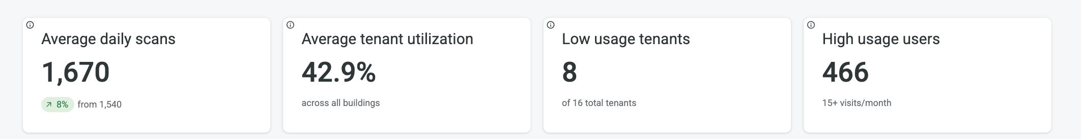
Average Daily Scans
Compares current period average daily access volume against the previous 90-day period. This tracks building traffic trends and momentum. Significant increases indicate growing occupancy or improved tenant engagement; decreases may signal a need for activation programs.
Average Tenant Utilization
The portfolio-wide average percentage of tenant employees utilizing building access. This establishes your baseline utilization benchmark. Individual tenants above this average are high-utilizers; those below may need engagement support.
Dashboard Cards
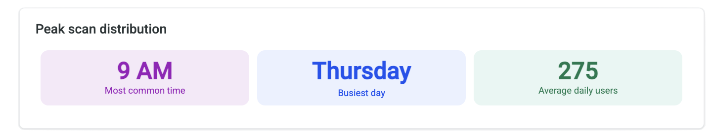
Peak Scan Distribution
Identifies the day of the week with the highest building traffic volume:
-
Most Common Hour: Peak traffic time
-
Busiest day: Peak day of the week with the most traffic
-
Average Users: Typical user attendance
Use this to understand peak occupancy patterns and optimize staffing, maintenance scheduling, and resource allocation.
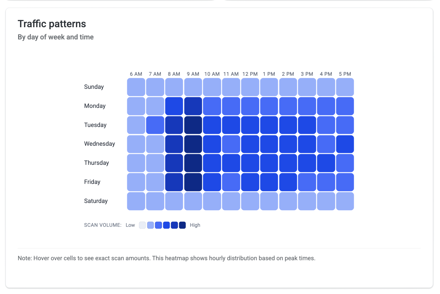
Traffic Patterns
Maps hourly access volume across each day of the week to reveal occupancy rhythms. The heatmap shows relative intensity from low to high traffic.
Use this to:
-
Identify peak occupancy windows for staffing and security
-
Spot differences between days (e.g., Tuesday-Wednesday peaks)
-
Plan maintenance or events during low-traffic periods
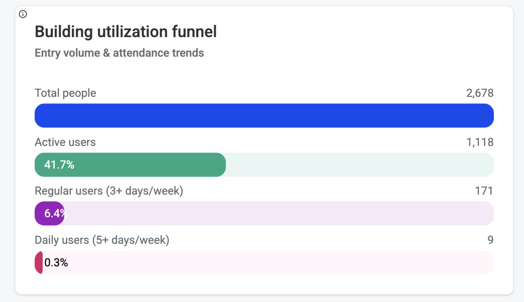
Building Utilization Funnel
Shows the conversion journey from total tenant employees to active building users at increasing engagement levels:
|
Level |
What It Measures |
|---|---|
|
Users |
Total tenant employees with access credentials |
|
Total Active Access Users |
Employees who have accessed the building |
|
+3 Visits |
Employees visiting averaging 3+ times weekly in 90 days |
|
+5 Visits |
Employees visiting averaging 5+ times weekly in 90 days |
This reveals drop-off in employee engagement at each frequency level. A small core of highly engaged users alongside many minimal/non-users indicates potential for activation campaigns.
Tenant Utilization
Ranks tenants by average weekly access frequency to identify highest-engagement organizations:
-
Average Weekly Scans: Frequency of access per week
-
Utilization Rate: Percentage of tenant employees actively using the building
-
Total Users vs. Active Users: Gap between credentialed and actual users
Top performers indicate strong space demand and can serve as benchmarks.
Low Usage Tenants
Identifies tenants whose employee utilization rate falls below the portfolio average. These tenants are flagged for potential:
-
Engagement outreach and programming
-
Space reconfiguration discussions
-
Lease optimization conversations
A high number of low-usage tenants may indicate broader building activation challenges.
Highest Attendance Users
The top 10 most frequent building visitors over the past 90 days:
-
Total Active Days: Number of days accessed
-
Most Recent Visit: Last access date
-
Days Since Last Visit: Recency indicator
These are your building champions and core occupants. Useful for understanding who drives building traffic and for targeted engagement or feedback initiatives.
High Usage Employees
Counts tenant employees who visit the building frequently (15+ times per month average). These employees represent the most engaged tenant workforce and are key drivers of building vitality, revenue stability, and community culture.
Champion Users
Employees with 15+ visits per month. This is your core occupant base with strong building commitment—natural advocates for programs and initiatives.
Access Data Sources
The Access dashboard pulls from:
-
Lenel NetBox (ACS) — Full scan coverage including physical badge and wallet
-
HID Origo BLE — Mobile credential scans provisioned through HqO
Note: Mobile Access Utility Button clicks are not included in Access/Utilization metrics—those are measured under Awareness.
Access Use Cases
|
Situation |
What It Means |
Recommended Action |
|---|---|---|
|
High Utilization, Specific Days |
Clear peak patterns |
Align programming and staffing to peak days; consider off-peak incentives |
|
Large Funnel Drop-off |
Many credentialed users never visit |
Launch activation campaigns; survey non-users on barriers |
|
Single Tenant Low Utilization |
One company underusing space |
Direct outreach to tenant contact; explore if space meets their needs |
|
Declining Average Daily Scans |
Building traffic trending down |
Investigate causes; consider return-to-office programming |
|
Small Core of High-Frequency Users |
Few power users, many occasional visitors |
Engage power users as champions; create reasons for occasional visitors to return |
Coming Soon
Communications Dashboard
Track campaign impact, channel effectiveness, and content promotion performance.
Events Dashboard
Track event performance, attendance, engagement, and revenue across your portfolio.
Related Articles